

But first… Quick Quote
The story of UPS Shipping begins with a smaller web app called Quick Quote. UPS felt their current solution wasn’t quick enough so I was tasked with reimagining the interface to have a simpler layout that would be easier to follow. I implemented a progress bar at the top to help users know where they were in the process and be able to move back and forth between tabs to make edits. This approach tested well and was co-opted for the main shipping flow.

The New Shipping Flow
Step 1: Where
Part 1 of this step presents the user with a form to enter the shipper’s address and contact info. Part 2 replays that information at the top and then collects the recipient’s info.


Step 2: What
For UPS, a critical piece of information is knowing the size and weight of a shipment. In this step, the user is provided with a visual guide to help them understand how to measure the dimensions of their package.


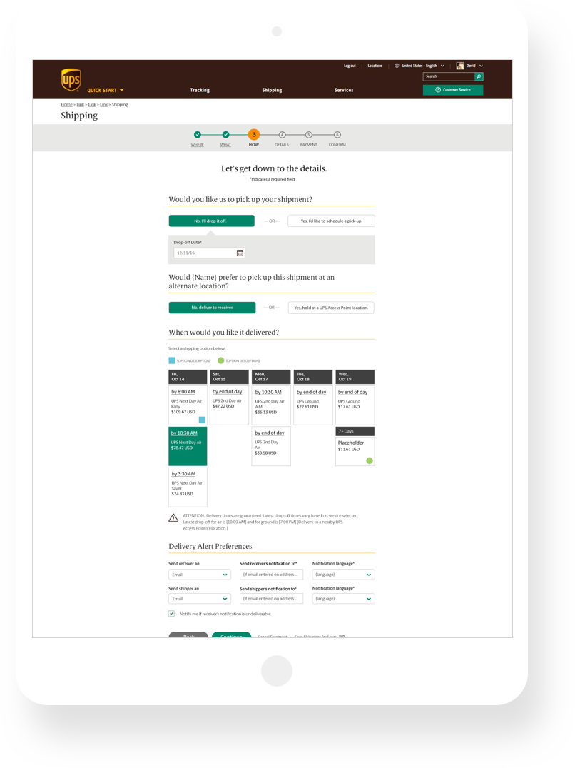
Step 3: How
This step helps the user determine what type of shipment service they need by displaying a simple grid view of delivery dates and times.

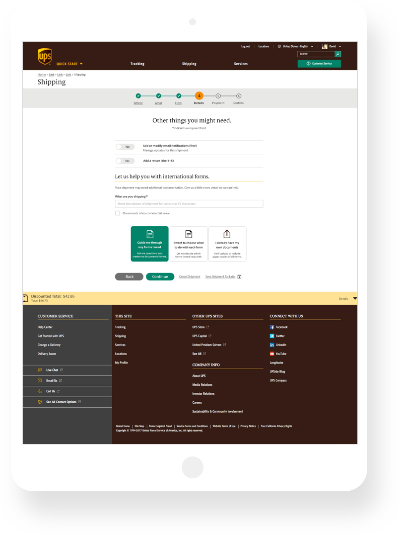
Step 4: Details
Here, you can add email notifications or a return label if necessary. Is your shipment traveling overseas? Users will also find options on how to complete the necessary customs forms through a series of step-by-step modals.

Step 5: Payment & Review
With all of your shipment information in place, you can now enter payment. The user is presented with clear options for payment types along with the ability to tie the payment to an account or send the bill to a secondary payer. Upon entering payment, the review screen will let you double check and make edits all of your info before finalizing the shipment.

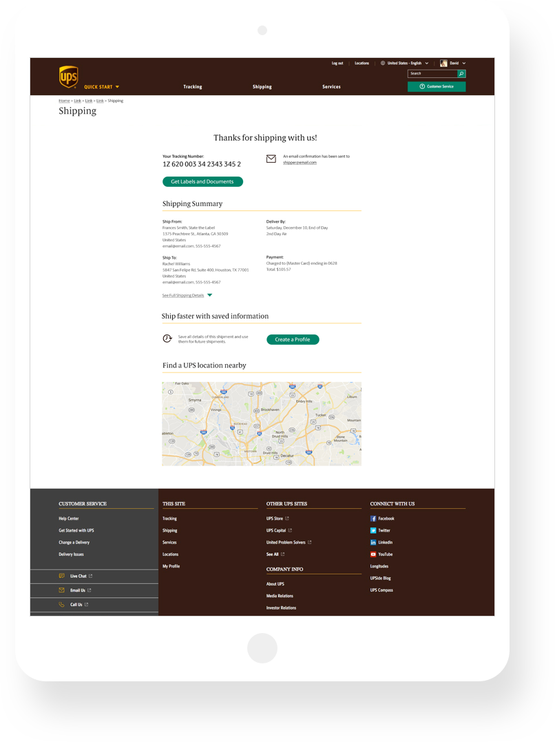
Step 6: Confirm
After completing your shipment, you’ll see your new tracking number, a summary of your shipment info, a CTA prompting you to create a profile to help speed up your next shipment and a map to help you find a UPS Store near you.
Balance Bar
One thing users gave plenty of feedback on was wanting more transparency about the price of a shipment. We created the “Balance Bar” which is a sticky drawer that can show the user at any time how the current estimate breaks down with fees related to the options they’ve selected.

Responsive Mobile Views
The new shipping experience was designed with a mobile-first mindset. Form elements flow seamlessly into a single column layout for mobile screens and retain the full feature set from the desktop experience.


Prototype Demo
This video shows an early round of the redesigned shipping flow. We implemented a movement style to help reinforce the feeling of going forward after completing the steps.
Shipping Launch Video
My colleagues in Austin created a promotional video to help spread the word about the new shipping experience.